
Whilst we’re in the enviable position of being able to operate pretty much as usual, we’ve seen first-hand how the current crisis is proving a massive challenge for some of our customers. We’d like to do what we can to help other organisations that are more directly affected than we are.
So, as far as our own costs allow, we’re offering a few Scottish business’s free access to our cloud analytics and forecasting platform for a few months to help ride out the crisis. Our hope is that we can help with short term financial planning or enabling staff to work from home, so local organisations are better able to survive the crisis.
Our resources are limited, and we will put in some of our own time and effort to help organisations on board, so we need to limit this offer to a few companies we think we can make the most difference with. The software works best for medium or large organisations who have enough data to make forecasting accurate or remote access challenging.
If you think this could help your organisation, please just get in touch at https://inmydata.datapa.com/about/contact-us
 Like most people in the IT industry of a similar age (close enough to 50 to see the hairs poking out its nostrils), I’ve seen a lot of change. That said, it’s hard to think of any technology that has the potential to change so many working practices and industries as the current developments in machine learning and data analytics. For an analytics vendor like DataPA, staying at the forefront of such developments is a constant (but exhilarating) challenge.
Bringing fresh, new ideas into the business
It’s one of the reasons we at DataPA often take on students for a summer placement. It not only brings new ideas into the business, but also makes long term recruitment of fresh talent much easier. Our experience this summer was a perfect example of why embracing new talent is always a good idea.
For many customers on inmydata*, our cloud analytics platform, forecasting is a critical requirement for their business. For instance, our retail customers need sales forecasts to set targets and deliver stock planning. So, we scoped out an R&D project to discover whether we could use machine learning to automate forecasting for our customers.
Luckily for us, The DataLab run a fantastic MSc placement project in Scotland for data science, data engineering and analytics that includes a 10 to 12 week industrial placement. Through that program we engaged with the brilliant MBN Academy, who within a week matched us with Callum, a Data Engineering MSc student from Dundee University.
Delivering automated forecasts with improved accuracy
Things progressed well over the summer. For some of us in the business it took some frantic googling to keep up. RNN, LSTM, DeepAR and Prophet!? At least we’d heard of Facebook. There was, however, no arguing with the results. Testing against data from previous years, the models Callum built could predict annual sales within 2% of the actual figure. That compared with a 15% margin of error for the manual forecasts the customer had used in practice. To put that into context, the manual forecast was over £15 million out on sales of just over £100 million, whereas the automated forecast was less than £300,000 out.
Accurate automatic forecasting on demand
Since Callum finished his dissertation with us, we’ve been integrating the models he developed into our cloud platform. We can now deliver accurate forecast models on demand, automatically building rolling forecasts on a weekly basis. It’s a development that not only offers huge opportunity to our existing customers, but also allows us to compete much more aggressively in the crowded analytics market space.
Taking part in DataLab’s MSc Placement Project this summer has been fantastic. MBN Academy made it utterly painless to recruit Callum. In the short time he was with us he was a pleasure to work with and delivered real benefit for both DataPA and our customers.
Find out more about The Data Lab’s MSc programme and how you can get involved in offering a placement opportunity.
* inmydata is an innovative cloud analytics solution. It delivers everything you need to set the right goals for your organisation, and then measure your progress in achieving them.
We’re never short of candidates for “the next big thing” in the IT industry. Not surprising given the rate of change, but even for those of us working in the industry it can be disorientating. One of the latest contenders is "Serverless Cloud Technology". So, what is it, and how the heck can you run any software without a server?
Well, you can’t. The term “serverless” refers to the developers experience of the platform, not the underlying architecture. Serverless cloud computing is simply an evolution of existing cloud technologies.
Ultimately, cloud computing is about delivering Software as a Service (SaaS), online applications such as an email or sales system. Most companies that deliver a SaaS solution don’t own the computers that host the software. Some simply rent servers from a cloud provider. This is the simplest form of cloud hosting, called Infrastructure as a Service (Iaas).
IaaS removes the cost and maintenance burden of the hardware for the developer. However, there’s still plenty of work to provision each machine and the environment to host the application. So, around 2006 cloud service providers began building platforms using a technology called containerisation. Containerisation allows multiple processes to run on a single machine, sharing the hardware resources yet remaining isolated from each other. “Platform as a service” (PaaS) meant developers only paid for the compute resources they needed (rather than whole machines) and could quickly scale those resources as their requirements grew.
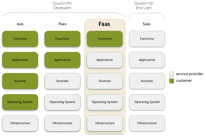
Serverless cloud computing, sometimes called “Functions as a Service” (FaaS), takes this abstraction a stage further. Most applications only require compute resources in response to events. For instance, an email application only needs to do something when an email arrives or a user logs in. For large periods of time it’s just sitting around waiting for something to happen. An application on a PaaS platform needs to be permanently loaded into a container, waiting to respond to these events. Generally, a single containerised instance of the application will service many requests, and additional instances will be started to cope during busy periods. However, starting additional containers can take several minutes, so PaaS platforms can be slow to respond to spikes in traffic. On a serverless platform, the developers code is run “on demand” only when these events occur, with the compute resources required also delivered “on demand”. The developer only pays for compute resources when they are being used, not when the application is waiting for something to happen. More importantly, the application can scale virtually instantly to almost any level of demand.
Serverless computing does have its drawbacks. It imposes constraints on the design of the software, for instance all functions must be stateless, and it’s difficult to move applications between different providers. However, it does offer a very powerful new paradigm for cloud computing. One which for many developers can deliver significant cost and performance benefits.
Our cloud analytics platform, inmydata, is built using serverless cloud architecture
 As an analytics vendor based in Edinburgh we are not new to the world of data science. Indeed, DataPA was amongst the first software developers to enter the field of analytics over 15 years ago. In that time, we have delivered software to more than 30 thousand users in more than 300 companies, both as an embedded technology for our technology partners and as a stand-alone application to our direct customers.
Throughout that time, innovation has always been at the core of what we do. In recent years we have been building on the developments in big data processing and machine learning to ensure we remain at the forefront of the huge disruption we see coming for analytics software. Our goal is to use these technologies to automate the role of the business analyst, reducing the cost and failure rate for analytics implementations. Our first commercial product from this research went live with a customer in January, marking the start of a long road of development and innovation.
So, we are hugely excited about the leading role Scotland is playing in the development of data science. The vibrant academic and business environment attracting talent from across the world, with the support of the Scottish Government and great organisations like DataLab are the perfect environment for companies like ours to flourish. For us, DataSummit18 is an ideal opportunity to showcase what we have been working on and learn from the international talent that the event attracts. If you are going to be at DataSummit18, please stop by out stand. We have lots of real world experience to share and are hungry to learn from others in the data science community.
 Choosing an embedded analytics solution can be an intimidating task. Get it right, and you’ll add huge value to your application, cementing its place with your existing customers and increasing its saleability for many years to come. Get it wrong, and you’ll waste a huge amount of time, effort and no doubt money. So, we thought we’d put together an article to help guide that decision. It’s biased, obviously, we are after all an embedded analytics vendor. But it will, we hope, ring true for any who have recently gone through the process.
First off, any solution you choose should look great. Analytics is first and foremost about visualising data so it can be understood at a glance. If a vendor can’t get that right, walk away. You should also be able to completely white label it. Embedded analytics is about improving your product, not selling someone else’s.
Second, any embedded analytics solution should be easy for the developer to use and integrate. Seamless integration with the business application needs data to be prepared at the back end, and the visualisation components to be embedded and integrated at the front end. If either of these tasks require the developer to learn a new language, or significant new syntax, it defeats the object of licensing a third-party product.
DataPA OpenAnalytics allows business logic to be expressed in a variety of languages, such as SQL, .NET or OpenEdge ABL. Moreover, our technology allows developers to hook into existing business logic already developed for the business application in any of these languages, to provide data transformation in the analytics layer. After all, why write it twice? We also make sure our training courses and documentation are tailored to specific audiences, so the examples and syntax can be lifted directly into our customers code. We don’t expect our customers to embark on weeks of training before they are comfortable developing with DataPA OpenAnalytics, and we don’t think you should consider a vendor that does.
The power of embedded analytics is providing intelligence within context. An example might be providing a sales person with information about past purchases for a product at a glance, as and when they are making a sale. To deliver this, it’s key that the analytics layer and business application are tightly coupled, with information flowing in both directions between the analytics layer and business application. This means it’s important the analytics engine has a flexible and complete API and component set, so analytics content can be tightly integrated in any client application, be it web, mobile, client, even wearable devices. Above all, it should be easy for the developer to leverage the analytics capabilities on every platform they develop for.
Delivering analytics is about more than just data visualisation. There’s a huge array of extremely impressive open source data visualisation components available today, free and simple use. If you just want to visualise simple data, why pay for a full analytics solution? To add value over and above these free components, an analytics solution must make it easy to draw data from anywhere and then blend, accumulate and transform that data to present it in the visualisation layer. It’s this analytics engine that makes the difference between simple data visualisation that allows for a pretty picture in a demo, and something that will deliver real, practical intelligence to an organisation.
Finally, and perhaps most importantly, make sure the company you choose to provide your embedded analytics combines real expertise in analytics with agility and a drive to innovate. As we’ve discussed previously in this blog, the analytics sector like most software markets is on the verge of huge change driven by the developments in big data and machine learning. Choose the right vendor and this disruption offers huge opportunities for your business and your customers.
 The market chatter about Big Data and AI is relentless. For Big Data, the statistics that many of us in the tech industry see bandied about are certainly eye catching; 2.7 Zetabytes of data exist in the digital universe today, 571 new websites are created every minute of the day, by 2020 business transactions on the internet will reach 450 billion per day etc. For AI, they are no less impressive; there was more than $300 million in venture capital invested in AI startups in 2014, a 300% increase over the year before; by 2018, 75% of developer teams will include AI functionality in one or more applications or services; by 2020, 30% of all companies will employ AI to augment at least one of their primary sales processes etc.
However, for many people not directly involved in the tech industry or the IT department of a huge multinational it’s difficult to see how these grandiose claims have any relevance to their day to day tasks. The real issue is, until recently, to do anything innovative with big data or AI you needed highly skilled data scientists versed in seemingly impenetrable technologies like NoSQL, R, MapReduce or Scala. And these guys are hard to come by and expensive, and not getting cheaper. IBM predicts that demand for data professionals in the US alone will reach 2.7 million by 2020.
However, that’s not the complete picture. Much in the same way computers began entering the business world as the preserve of large corporations like J Lyons & Company and the U. S. Census Bureau, were later more widely used as companies that could afford the huge cost of buying them provided services to others, and finally the productization of computers by the likes of IBM allowed almost every organisation to buy their own, Big Data and AI are going through the same process of democratization.
The major three Cloud data providers Microsoft, Google and Amazon are amongst a host of providers that now offer scalable and affordable Big Data platforms that can be spun up in seconds. In the last few years all three have also started offering API driven AI services bound into their cloud platforms. More importantly, those Big Data platforms and AI API’s are now becoming easily accessible to more traditional development environments like .NET. This means that millions of traditional developers can now leverage Big Data and AI without leaving the comfort of their familiar development environment.
The natural consequence of this will be an explosion of products that leverage Big Data and AI technologies available to even the smallest organisations, allowing the huge opportunities to filter down to all. In fact, here at DataPA we have spent the last twelve months working hard on a new automated analytics product leveraging Big Data and AI techniques, which we are hugely excited about launching in the coming months. The world is on the cusp of huge change that historically will rival the industrial revolution, and we are excited about sharing that journey with all our customers and partners in the coming months and years.
As an analytics vendor, we’re always keen to respond to our customers’ requests. So recently, we’ve been working hard to add mapping functionality which we will be releasing to our customers in the next few months. Before that however, we thought it might be useful to look at the role of geographic mapping in dashboards and explore when and how to use them.
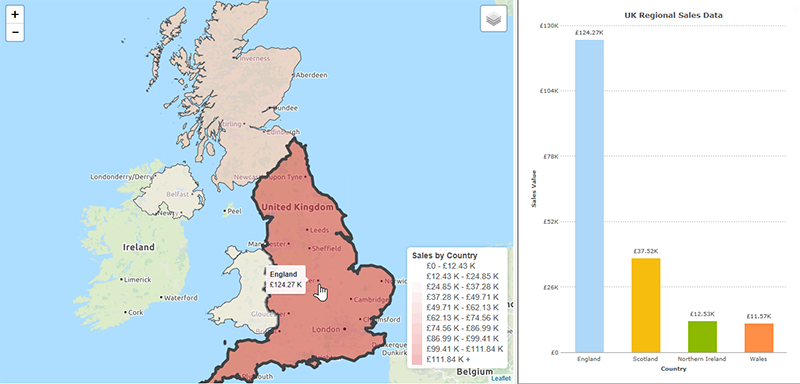
Maps are visually engaging and more exciting than a chart, so it’s tempting to assume that if your data is grouped by some geographical measure then you should be plotting it on a map. However, this is rarely the case. Consider the two displays below, both showing UK Regional Sales data. We already know the areas location, so plotting the data on a map doesn’t add anything. What we’re most interested in is comparing the value sold in each area. Both visualizations display this, the map with colour and the chart with the height of the bar, but it is much easier to get an instantly clear comparison from the chart.
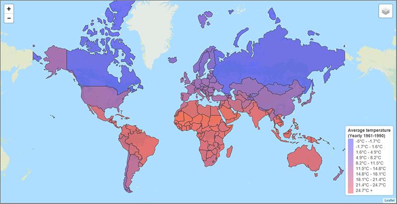
In contrast, take the example below that maps average temperature by country. From a quick glance, we can see that the coldest regions are the large land masses to the North, Western Europe is milder than Eastern Europe and Africa is warmest continent overall. In the context of the data we’re looking at, this is all hugely useful information that would not be apparent at a glance with any other representation of the data. This is a clear example of when plotting the data on a map adds to our understanding.
For a more practical example, take the dashboard below. It’s designed to inform the decision as to where a retailer should open their next store. The measure shown on both the map and chart is the population of each state divided by the number of stores, giving a measure of the population per store for each state. Given just the chart, we may choose to open a new store in California. However, the map suggests a different decision. Plotting a circle centred on each state, with the population per store represented by the diameter of the circle, the area surrounding New York contains a high number of overlapping circles. From the map, it’s clear that locating a new store here would potentially cater for more customers than one opened in California.
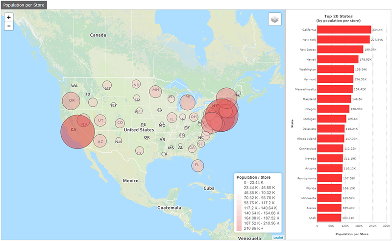
Indeed, the functionality of the map would also let us progressively zoom in and perhaps choose a specific location such as New Brunswick in New Jersey.
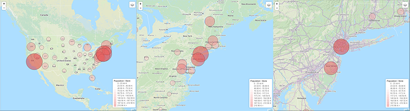
When deciding whether to use a map to represent your data, simply ask yourself the following question; does visually expressing the physical location of the data elements add to our understanding of the data? If not, some other object would likely be a better choice. This is in fact just a specific instance of a wider rule we should apply when designing any dashboard; if a visual element does not add to our understanding of the data, it is just clutter that makes the dashboard harder to understand, and as such should not be there.
If you’d like to find out more about DataPA OpenAnalytics, or our forthcoming support for mapping, please contact us.
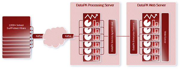
 Apache Kafka™ is a massively scalable publish and subscribe messaging system. Originally developed by LinkedIn and open sourced in 2011, it is horizontally scalable, fault tolerant and extremely fast. In the last few years its popularity has grown rapidly, and it now provides critical data pipelines for a huge array of companies including internet giants such as LinkedIn, Twitter, Netflix, Spotify, Pinterest, Uber, PayPal and AirBnB.
So, when the innovative and award winning ISP Exa Networks approached us to help deliver a live analytics solution that would consume, analyse and visualise over 100 million messages a day (up to 6.5 thousand a second at peak times) from their Kafka™ feed, it was a challenge we couldn’t turn down.
The goal was to provide analytics for schools who used Exa’s content filtering system SurfProtect®. Information on every web request from every user in over 1200 schools would be sent via Kafka™ to the analytics layer. The resulting dashboards would need to provide each school with a clear overview of the activity on their connection, allowing them to monitor usage and identify users based on rejected searches or requests.
The first task was to devise a way of consuming such a large stream of data efficiently. We realised some time ago that our customers would increasingly want to consume data from novel architectures and an ever-increasing variety of formats and structures. So, we built the Open API query, which allows the rapid development and integration of bespoke data connectors. For Exa, we had a data connector built to efficiently consume the Kafka™ feed within a few days.
The rest of the implementation was straight forward. DataPA OpenAnalytics allows the refreshing and data preparation process for dashboards to be distributed across any network, reducing the load on the web server. In Exa’s case, a single web server, and a single processing server are sufficient to allow the dashboards to be constantly refreshed, so data is never more than a few minutes old. To help balance the process, the schools were distributed amongst 31 dashboards, and filtered to a single school as the user logs in.
The final solution gives each school a dashboard, with data never more than a few minutes old, showing figures that accumulate over the day. Each dashboard allows the school to monitor web traffic and any rejected requests or searches on their connection.
We're really excited about what we delivered for Exa Networks, and think with the versatility and scalability the latest release of DataPA OpenAnalytics offers, we can achieve even more. If you have large amounts of data, whether from Kafka™ or any other data source, and would like to explore the possibility of adding live analytics, please get in touch, we'd love to show you what we can do.
The guiding principal when designing any dashboard should be to ensure your users understand key information at a glance. Ideally, a user taking their first look at your dashboard should be able to understand key information within a few seconds. Achieving this is not rocket science, simply applying a few simple principles to your decision making will transform your dashboards.
First off, make sure your dashboard is focused. If I’m looking at a dashboard that contains information for five different roles in the organisation, I need to filter out or navigate round views for all the others to get to the information that is relevant to me. That’s going to take more than a few seconds. Step one of building a dashboard should be to decide who the dashboard is for and to understand in detail what information is key to their performance. Limit your dashboard to just this information. Remember, five simple dashboards are always more useful than one complex one.
Next, always avoid clutter. The more complex the view you offer the user, the longer it will take for them to glean the information they require. Carefully consider every object and ask yourself “do I really need this? Is the information this object represents unique and important?”. If not, it’s just clutter, get rid of it.
A little more daunting at face value, but simple in practice, is the concept of using visual clues to help the user quickly recognise what they are looking at. There are two principles of design that are particularly useful with dashboards, similarity and proximity. Let’s take similarity first. Say I have a sales dashboard that shows total sales and profit in several different charts, say by sales rep, region and date. Design principles tell us that things that are similar are perceived to be more related than things that are dissimilar. As such, if I make sure that total sales is always plotted in blue and profit in green, the user is likely to recognise these values across the different charts quickly, without having to read the legend. This principle applies to more than just colour. For instance, I may always plot charts that show sales over time as line charts, sales by region as bar and sales by person as column. A second design principle, proximity, tells us things that are close to one another are perceived to be more related than things that are spaced farther apart. Implementing this is simple, make sure you place objects that are related close together, giving the user another visual clue as to their meaning.
The final tip for creating great dashboards is to think about when the data needs to be refreshed, and let this inform the design of your dashboard. An operational dashboard is likely to require real time data, so keep it simple so it updates fast. A strategic dashboard is more likely to be updated periodically, so you can afford to (and often want to) add more detail.
There are obviously many more considerations when building dashboards, not least your choice of visual objects, when and where to prepare data and much more. However, these are more particular decisions that deserve a blog in their own right. My hope is that in following the simple design principles above, you’ll quickly be creating more effective dashboards.
Just under a week ago today the much anticipated Apple Watch arrived in our office. If there’s one thing we could all learn from Apple, it’s how to build hype around a new product launch (even the delivery man hung around to see it opened). It was (as ever) not the first device in this category, but certainly the most anticipated. So a week later, how does it compare to the Android Wear devices we already had in the office?
The first difference is something of a given with Apple, it’s a lot prettier. Particularly compared to the LG G Watch we had which was just plain ugly. For something that you wear, that’s important. Secondly, and also something we’ve come to expect from Apple, the general interface for navigating around the watch is an improvement on Android Wear. This is largely due to the addition of the crown and button on the right of the watch that give simple scroll and select interfaces, but also the layout of the home and other screens. There’s also the built in heart monitor. Apart from the obvious applications for sport and health apps, this also means the watch knows when it’s being worn so alerts don’t fire at night when your watch is on your bedside table.
Which brings us neatly on to alerts. We’ve discussed many times in this blog that it’s alerts that really differentiate smart watches from other tech. You never miss your watch vibrating on your wrist, but nobody else is aware of it. As such they provide a more reliable yet less intrusive alerting mechanism than our smart phone. We’re interested in these devices because DataPA OpenAnalytics allows “citizen developers” to build almost any alert capability into the business process. Combine this with a smart watch and a factory shift manager could be notified immediately, regardless of his location and surrounding noise levels, if a large order was placed that will significantly raise demand. Or a retail area manager driving between stores can be notified immediately when demand for a particular product rises suddenly across several shops he manages. Or your database administrator can be notified immediately when a database is close to filling its allotted disk space.
It’s in this regard, which we believe is critical to the real value of the smart watch, that Android Wear perhaps retains an edge over the Apple Watch. From the developers perspective the Android Wear alerting framework is much more flexible, easily allowing us to display a custom alert that the user can swipe to see the chart, then tap to open in the app on their phone. These things can be achieved on the Apple watch, but it’s more difficult to engineer and the behaviour on the watch is less predictable.
However, these are small differences and only time will tell which of these two market leaders, if either, dominate this space. It’s early days for this tech at the moment, but in our opinion more companies like ourselves will see the possibilities it offers for both business and consumers, and a few years from now smart watches could be as ubiquitous as the smart phone.
Copyright © 2020 DataPA Limited. All rights reserved. Privacy & Cookie Policy