
Items filtered by date: February 2017
A quick guide to building great dashboards
The guiding principal when designing any dashboard should be to ensure your users understand key information at a glance. Ideally, a user taking their first look at your dashboard should be able to understand key information within a few seconds. Achieving this is not rocket science, simply applying a few simple principles to your decision making will transform your dashboards.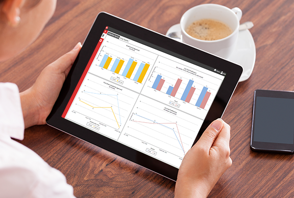
First off, make sure your dashboard is focused. If I’m looking at a dashboard that contains information for five different roles in the organisation, I need to filter out or navigate round views for all the others to get to the information that is relevant to me. That’s going to take more than a few seconds. Step one of building a dashboard should be to decide who the dashboard is for and to understand in detail what information is key to their performance. Limit your dashboard to just this information. Remember, five simple dashboards are always more useful than one complex one.
Next, always avoid clutter. The more complex the view you offer the user, the longer it will take for them to glean the information they require. Carefully consider every object and ask yourself “do I really need this? Is the information this object represents unique and important?”. If not, it’s just clutter, get rid of it.
A little more daunting at face value, but simple in practice, is the concept of using visual clues to help the user quickly recognise what they are looking at. There are two principles of design that are particularly useful with dashboards, similarity and proximity. Let’s take similarity first. Say I have a sales dashboard that shows total sales and profit in several different charts, say by sales rep, region and date. Design principles tell us that things that are similar are perceived to be more related than things that are dissimilar. As such, if I make sure that total sales is always plotted in blue and profit in green, the user is likely to recognise these values across the different charts quickly, without having to read the legend. This principle applies to more than just colour. For instance, I may always plot charts that show sales over time as line charts, sales by region as bar and sales by person as column. A second design principle, proximity, tells us things that are close to one another are perceived to be more related than things that are spaced farther apart. Implementing this is simple, make sure you place objects that are related close together, giving the user another visual clue as to their meaning.
The final tip for creating great dashboards is to think about when the data needs to be refreshed, and let this inform the design of your dashboard. An operational dashboard is likely to require real time data, so keep it simple so it updates fast. A strategic dashboard is more likely to be updated periodically, so you can afford to (and often want to) add more detail.
There are obviously many more considerations when building dashboards, not least your choice of visual objects, when and where to prepare data and much more. However, these are more particular decisions that deserve a blog in their own right. My hope is that in following the simple design principles above, you’ll quickly be creating more effective dashboards.
Copyright © 2020 DataPA Limited. All rights reserved. Privacy & Cookie Policy